DT—26
Sharon Du
Sharon Du is an illustrator from China who enjoys exploring visual languages across various projects. Influenced by dramatic storytelling and atmosphere-building, her work focuses on how images can create clear, cohesive visual systems between narrative and design. She enjoys experimenting across illustration categories and adapting style, texture, and visual pacing to fit different themes. Outside of art, she enjoys and is inspired by traditional Chinese food. Looking ahead, she hopes to combine illustration with design thinking to create clear, scalable visual expressions for brand, publishing, and game projects.
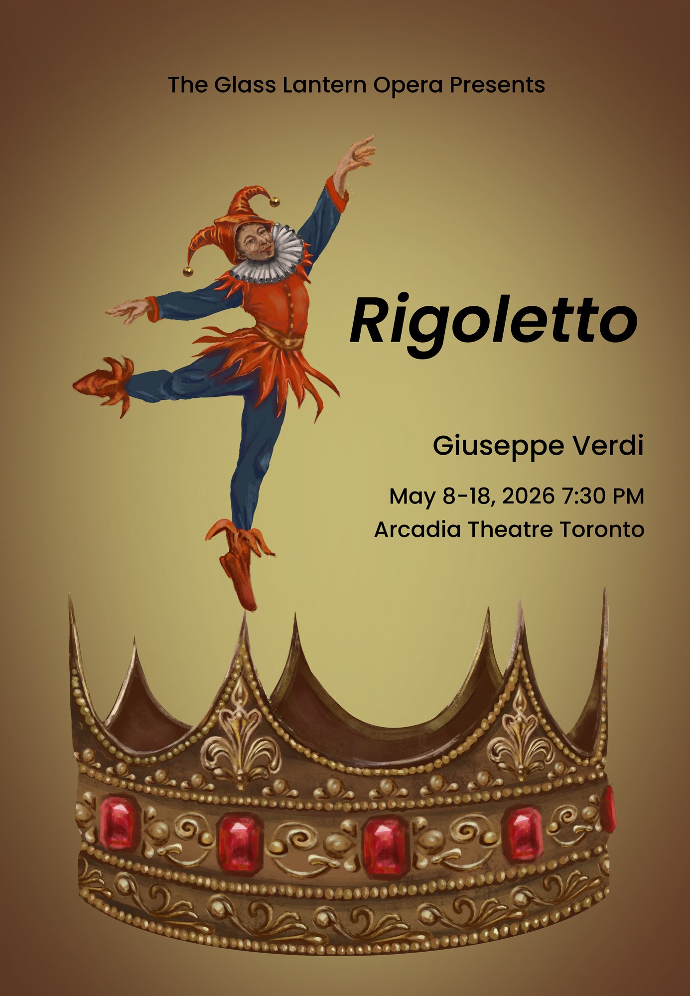
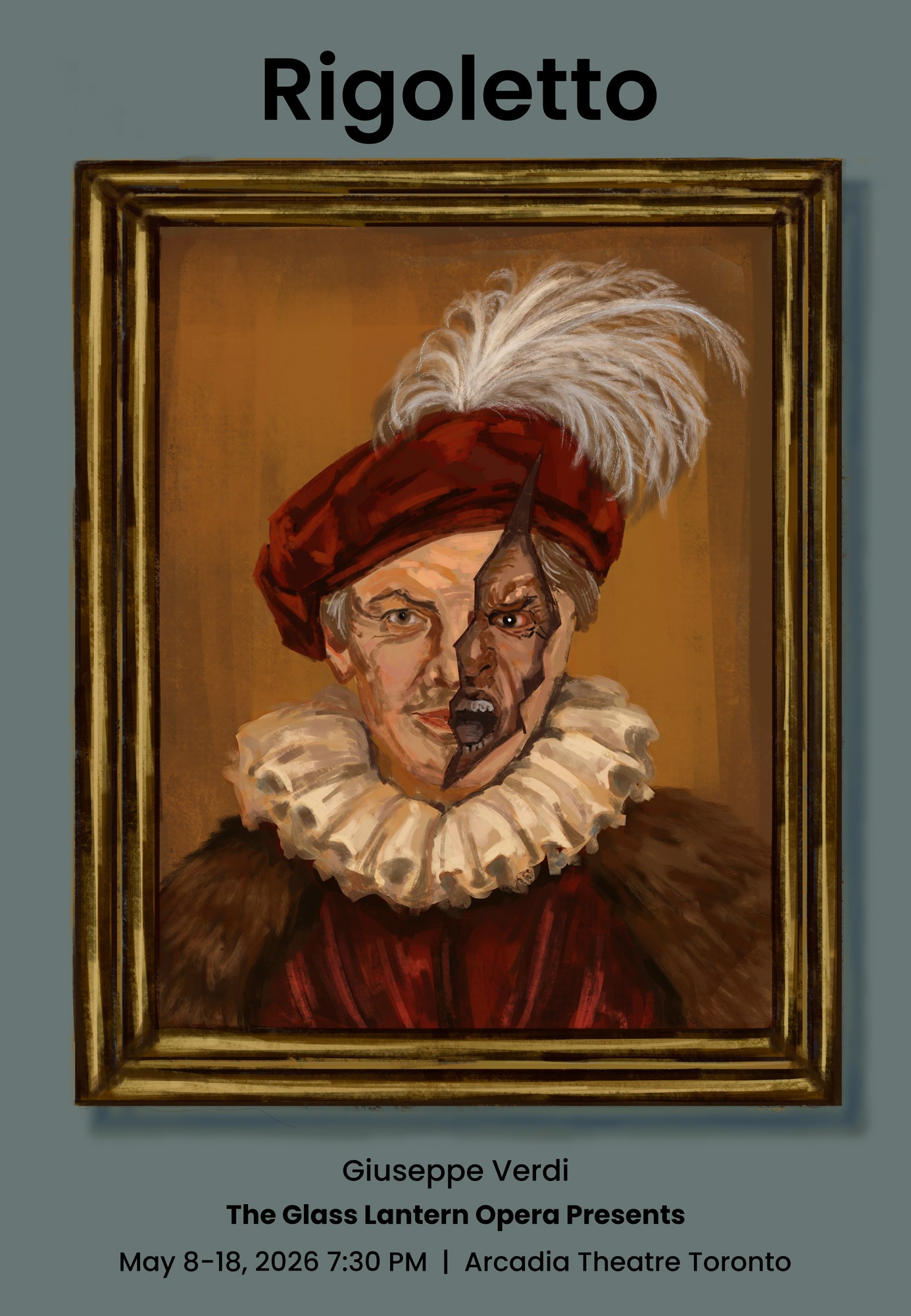
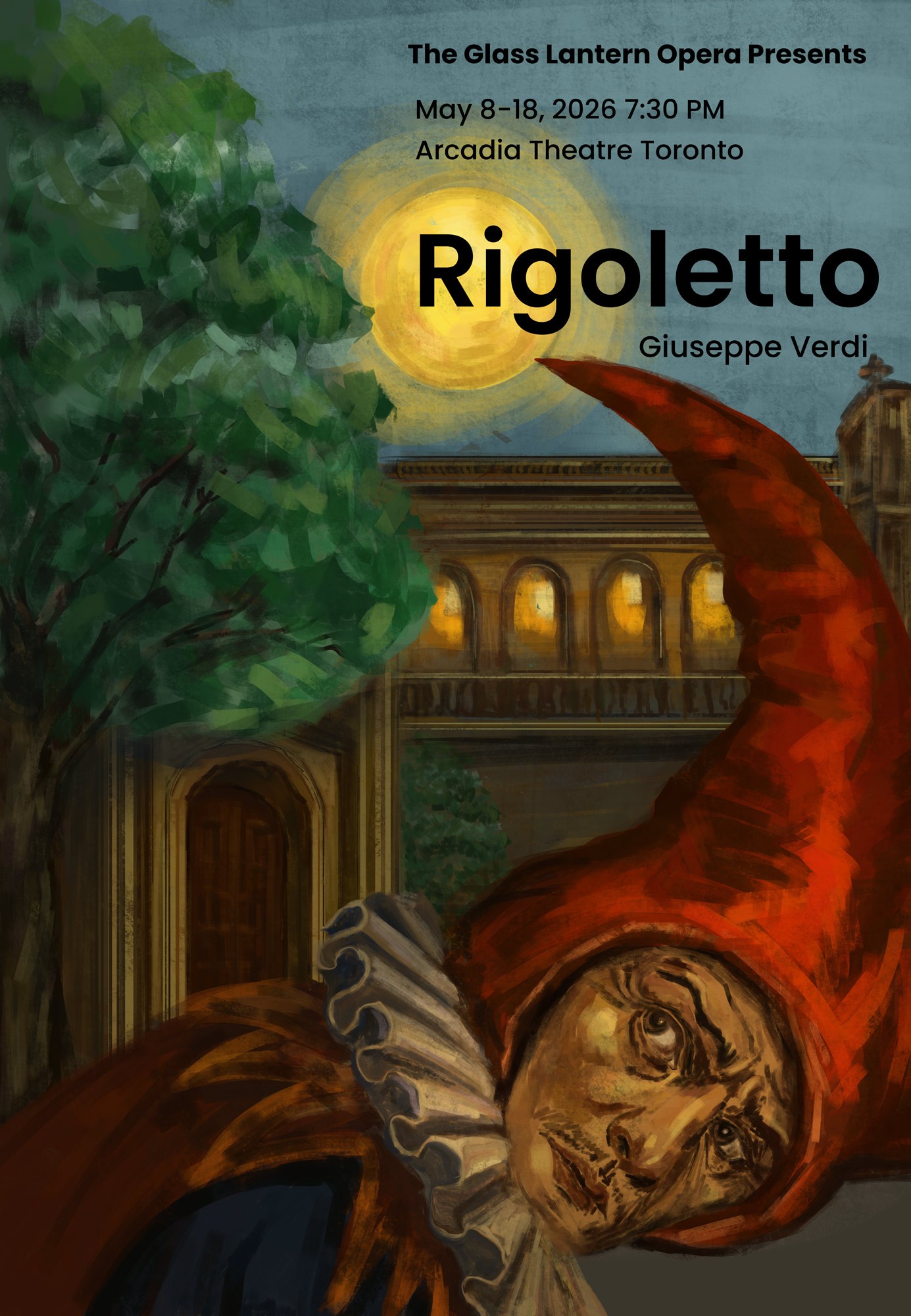
Rigoletto
A three-poster series based on the opera Rigoletto, depicting the court jester’s identity, situation, and fate within a structure of power. The work combines the image of a court performer, a torn portrait of the king, the curse of a nobleman, and the scene of returning home at night, linking character relationships, displays of power, and an underlying sense of revenge. This series presents the story of Rigoletto and shows how power shapes the characters’ circumstances and outcomes.
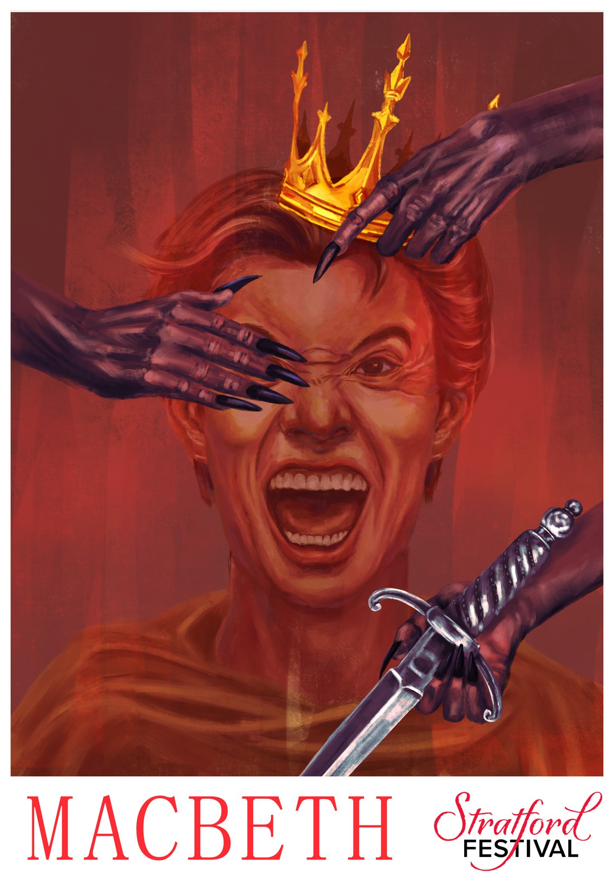
Macbeth
A concept poster project based on Macbeth, exploring themes of ambition, power, and madness. Centered on the figure of the king, the image suggests his descent into violence, guilt, and loss of control through symbolic elements such as crowning, a covered eye, and a dagger.
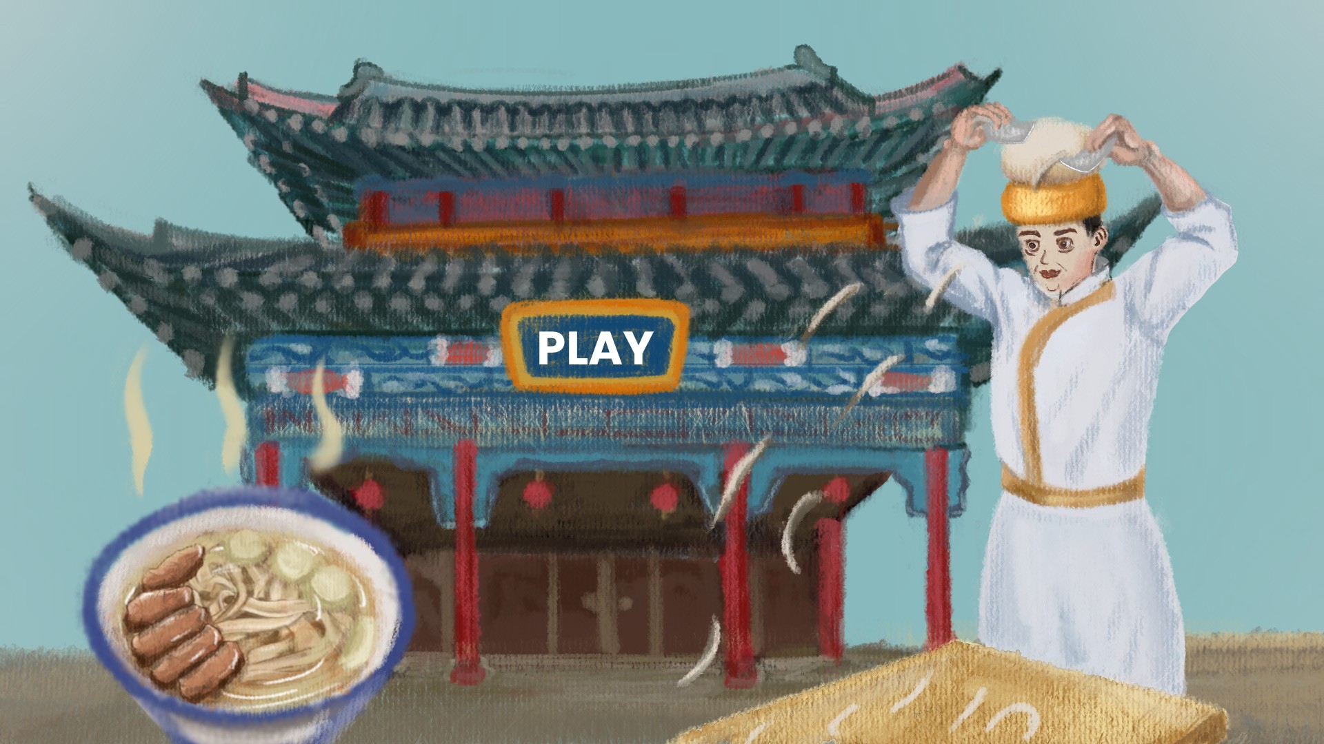
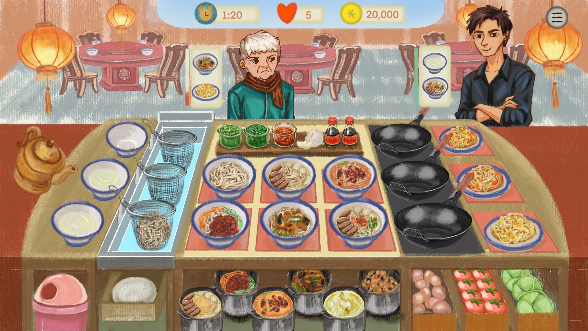
Knife Cut Noodles Restaurant
A concept design project for a restaurant management game inspired by the culture of Shanxi knife-cut noodles in China, centered on the spatial atmosphere and everyday operations of a traditional noodle restaurant. Through the visual design of the game’s opening screen and gameplay scenes, the project presents restaurant activities such as taking orders, preparing ingredients, cooking, and serving food, while transforming local food culture into a game world that feels like everyday life.
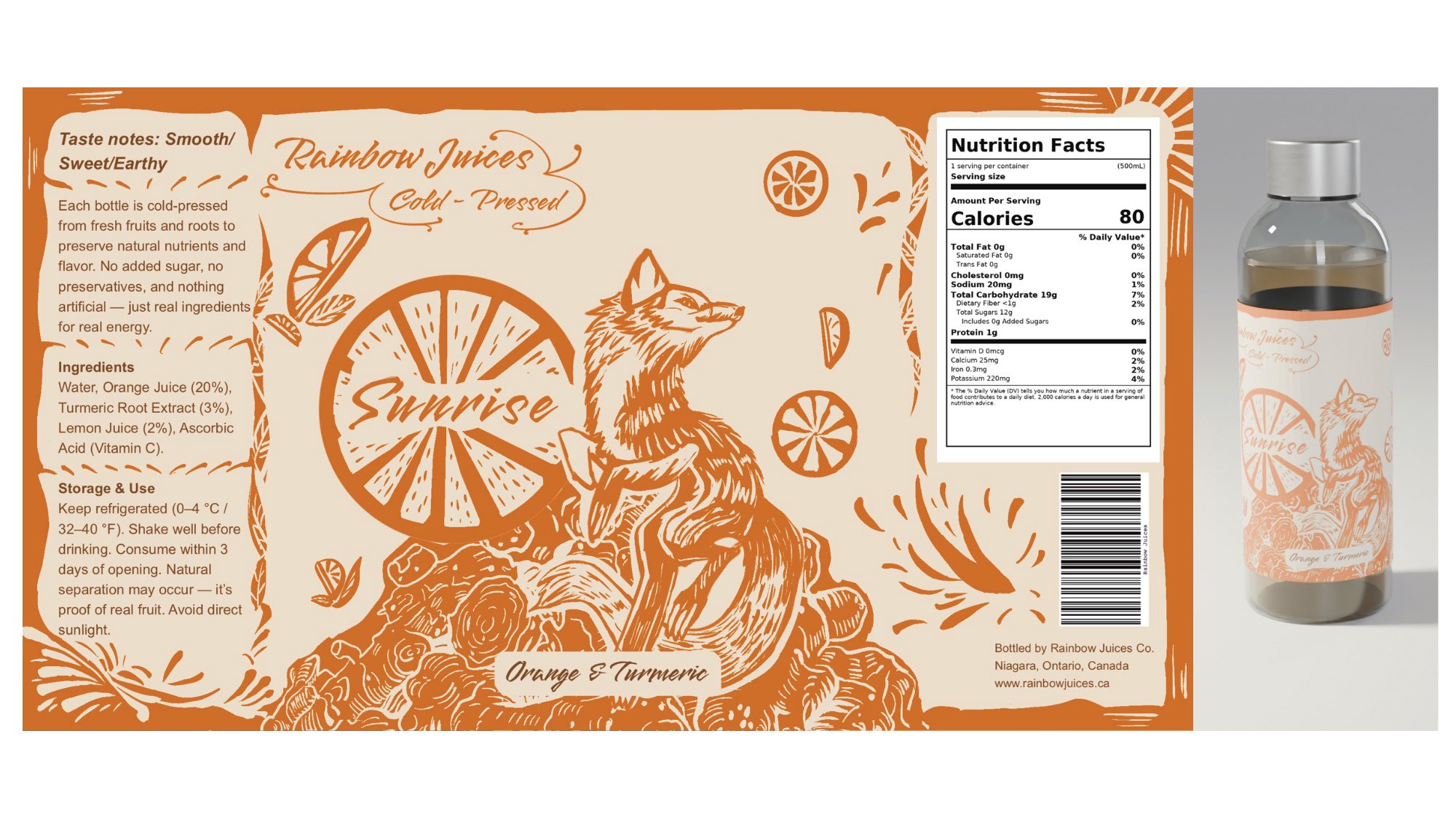
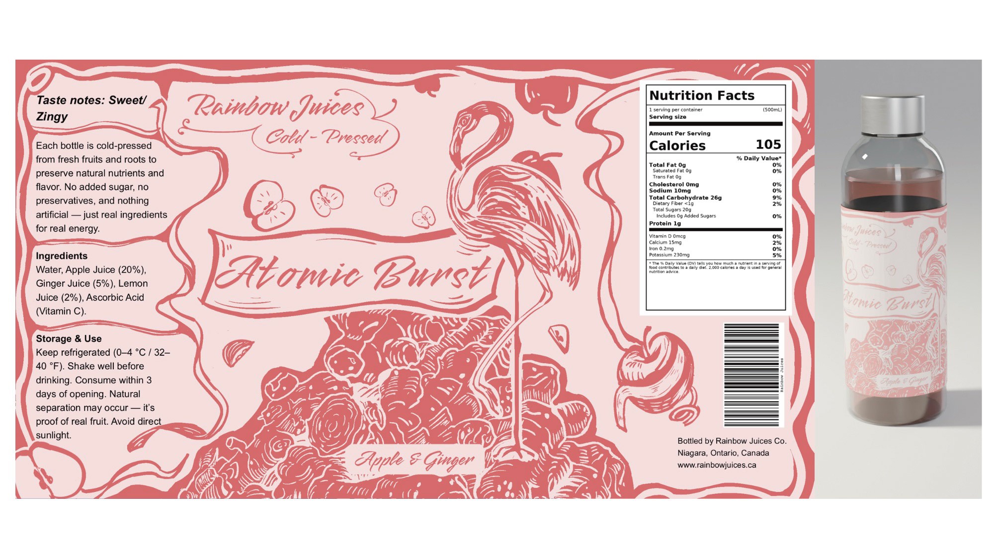
Rainbow Juices
A packaging series designed for a juice brand featuring six cold-pressed juice flavours. Each product is distinguished by fruit combinations and animal imagery. This project shows how packaging can maintain consistency across a product line while still clearly distinguishing between flavours.