Beyond
Dave Murray on Creating Toronto’s FIFA World Cup 2026 Poster
Sheridan Illustration alumnus and faculty member Dave Murray is the artist behind Toronto’s official FIFA World Cup 2026 host city poster. Chosen from more than 550 submissions, the poster represents Toronto as the city welcomes the world’s largest sporting event.
With plenty already written about the artwork itself, we took the opportunity to ask Dave about the process behind the project, the challenges of creating an image for a global audience, and how his experiences as both an illustrator and educator informed the work.
The World Cup is one of those rare projects where you’re creating for a local audience and a global audience at the same time. How did that influence the way you approached the poster?
Creating an illustration that satisfies both a local and global audience, and everyone in between – the casual fans, the die-hards, those coming to visit Toronto for the first or fiftieth time, and even those who may be completely taken by surprised that the World Cup is coming to our city – is, and was, almost an unwinnable challenge. From my own perspective, how does one capture the essence of Toronto without defaulting to a favourte neighbourhood, an iconic landmark (more on that in the next question, btw), or some sort people-friendly, in-joke personification (like, say, a raccoon)?
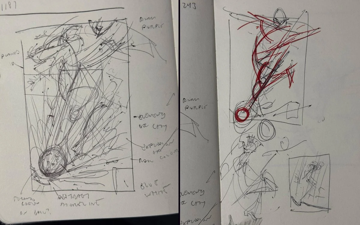
My starting point was the FIFA archives. I took a deep dive into the wonderful history of World Cup posters, taking careful notes of what has resonated over the decades, and what has become iconic. Was there anything that sparked something visually in my brain? Was there anything that could speak to my style? A second guidepost was the city itself. Toronto is a fantastically multicultural city, a patchwork of amazing food, music, and people. Toronto’s World Cup Slogan is “The World In a City” – I started to ask myself how that could be approached in more abstract ways.
When you first received the brief, what was the biggest creative challenge you needed to solve before you could start drawing?
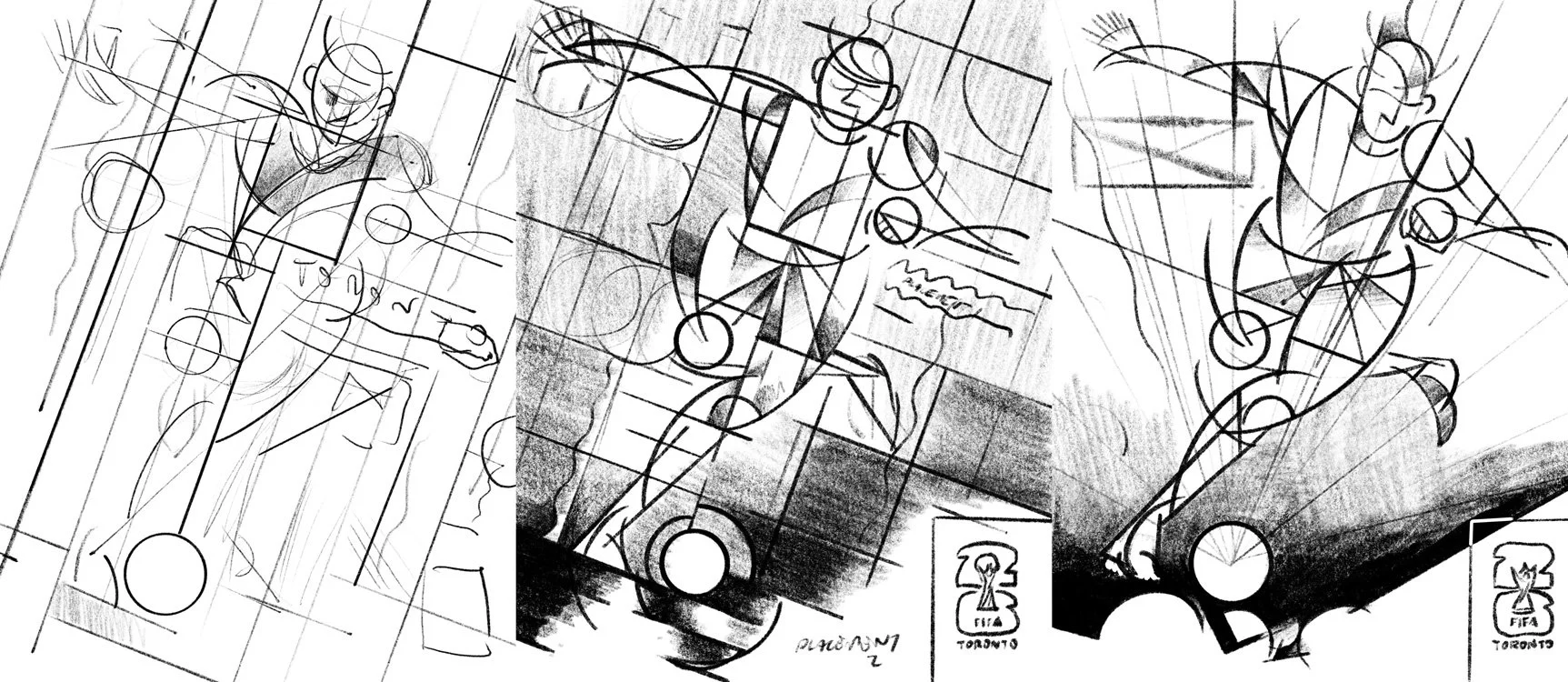
The largest creative challenge, without a doubt, was that no poster entry could feature any recognizable buildings, infrastructure, or people. This compounded the initial ask of creating something that satisfies both locals and those worldwide. How do you represent Toronto when the most recognizable shorthand for the city, the skyline, is off-limits?
That inspired a counter-thought, though. Yes, most people who visit Toronto would recognize the skyline and downtown core, but Toronto is geographically MASSIVE. From Etobicoke to Scarborough, the lakeshore to North York, Toronto is expansive – and that’s what made the process “click” for me. The biggest tournament, coming to a big city; the entire city becomes the playing field. This isn’t limited to downtown, this can be for everyone, in every neighbourhood. It’s colossal.
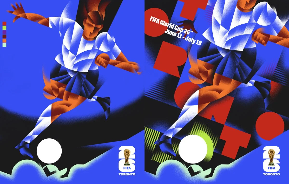
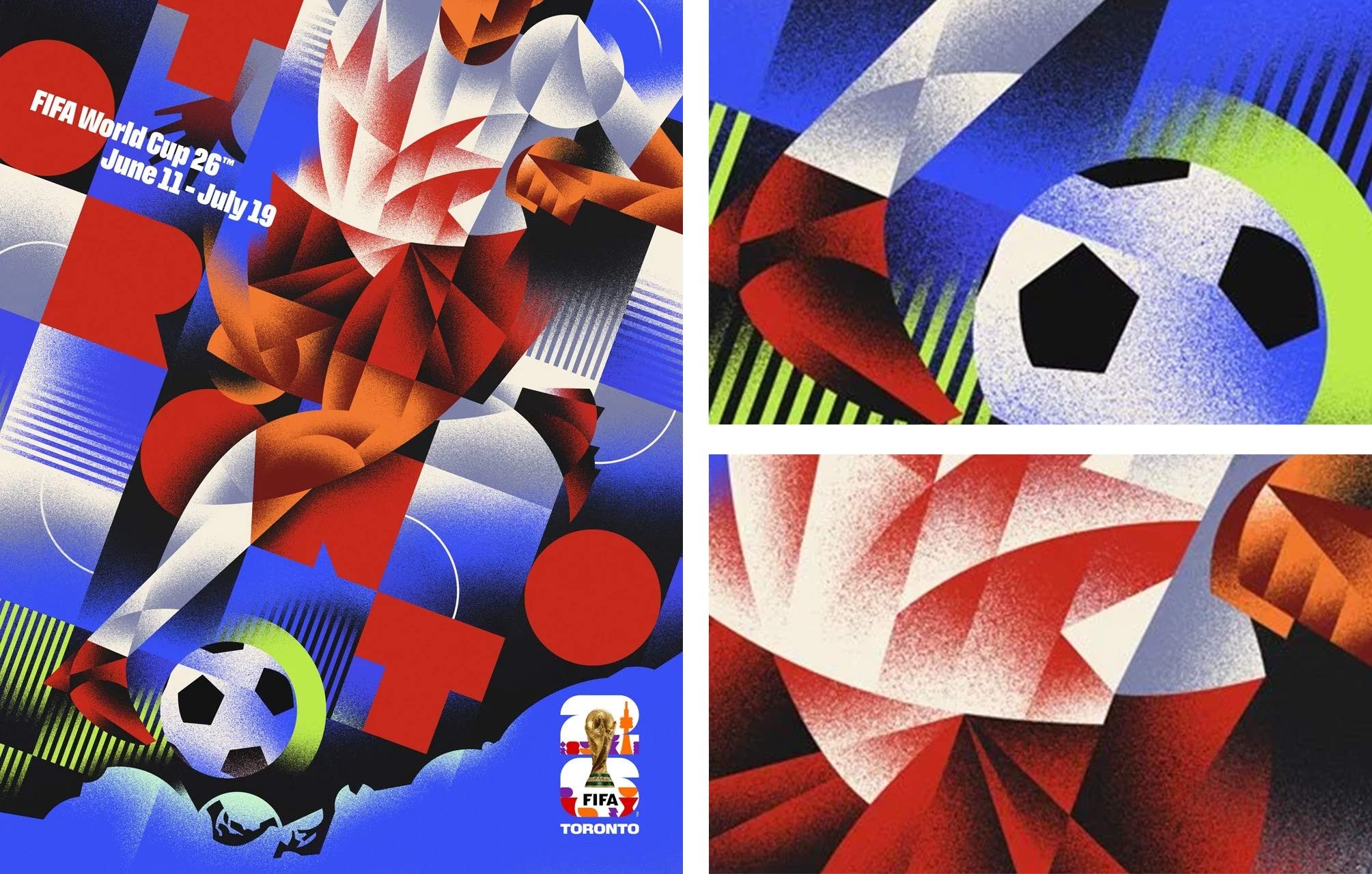
What part of the final poster are you most proud of that viewers might not immediately notice?
With the over-arching concept solved, composition came next. I try to have a lot of fun when composing my work, seeing where I can create motion, and draw the eye through the “fracturing” of my subject. By taking an aerial view of Toronto, I was gifted with a strong compositional base, which is Toronto’s unique shoreline. It gave me a pretty natural target to create a point of action or target. In this case, it’s the soccer ball, moments before being struck, which is great – but what might go unnoticed is the location of the ball. It’s pure kismet, but the direction of the shoreline, and how that set me up to place the ball there ended up right over the area where Toronto Stadium is (typically BMO field, where the games will be hosted). Sure, I couldn’t illustrate the stadium, but having it as the focal point of the action seemed like a great solution. From there, I was able to radiate compositional lines from the centre of the ball, creating more motion, a feeling of explosive energy, and subtly draw the viewers’ eye towards the “stadium”.
As both a Sheridan Illustration graduate and now a faculty member, did the project make you reflect differently on your own path as an illustrator?
Short answer: it’s been an incredible journey so far. Longer answer: in between my 3rd and 4th year, I did my co-op placement with Tavis Coburn. Working with Tavis opened my eyes to how big illustration could get, and defined what the world of illustration is; it added so much clarity. What maybe was still a bit of a naive approach and sentiment towards my own work was replaced with the realization that I COULD see my work on the side of the largest stadiums, and have it be worldwide. That my distinct visual voice (which at that time was still VERY not a thing) could define something, add true meaning, or -very surface level- just be something people thought was COOL.
I mean, my very first day working with Tavis, we jumped into working on visuals for Richard Branson’s F1 racing team. Crazy.
All that being said, being a Sheridan Illustration grad, and now faculty member, has been a pretty meaningful “full-circle” moment. Everything that was impressed upon me was true – the grind, the late nights, creative blocks, TAXES – but it has 100% been worth it, and I’m excited to share what I’ve learned along the way with my students.
Has teaching illustration changed the way you approach your own professional work?
Immediately, it’s reminded (and forced) me to beef up the fundamentals of my own practice. Creating a successful image is (obviously) a big part of what we do, but I believe that lasting success comes from a strong back-end and largely unseen foundation. I like to emphasize clear communication, scheduling, and file organization when I teach. I trust my students to be able to bring artistic talent to the table, but it’s the unglamourous “chores” of the job that will make one’s life so much easier as they move through their career.
So, in a real “practice what I preach” moment, I’ve been thinking so much more about those fundamentals. It would be so easy to get swept up in something as big as the World Cup, and lose track of where I am, but staying consistent with the little details has allowed me to enjoy this success while also looking forward to whatever comes next.
See more of Dave Murray’s work at davemurrayillustration.com